
HTML and CSS Highlights
0x01. AirBnB clone - Web static - HTML - CSS - Front-end - Web Accessibility Initiative (WAI) - CSS Specificity Value - layout - positioning - grid - favicons

Intro.
How does the browser load a webpage:
The process of loading a webpage in a browser involves several steps, from making a request to the web server to rendering the content on the user's screen. Here's a high-level overview of how the browser loads a webpage:
1. **User Input or URL Entry:** The process usually begins when a user enters a URL in the browser's address bar or clicks a link. The URL represents the address of the webpage they want to visit.
2. **Domain Name Resolution (DNS):** The browser needs to resolve the domain name (e.g., www.example.com) into an IP address. It does this by sending a Domain Name System (DNS) request to a DNS server, which returns the IP address associated with the domain.
3. **HTTP Request:** The browser establishes a connection to the web server using the obtained IP address. It sends an HTTP request to the server, requesting the specific webpage's content.
4. **Server Processing:** The web server receives the request, processes it, and prepares the appropriate response. This response typically includes the HTML, CSS, JavaScript files, and any other assets required for the webpage.
5. **HTML Parsing:** The browser starts parsing the received HTML content. It constructs a Document Object Model (DOM) tree, representing the structure of the webpage's elements.
6. **Parsing and Rendering:** As the browser encounters CSS links or styles within the HTML, it starts fetching and parsing the linked CSS, JS files. The parsed information is used to apply styles to the DOM elements, forming the Render Tree.
7. **DOM Construction and Rendering:** As resources are fetched and processed, the browser continues building the DOM and constructing the Render Tree. The Render Tree is used to determine the layout and visual representation of the webpage.
Throughout this process, the browser aims to provide a seamless and interactive user experience, progressively rendering content as it becomes available. Modern browsers also employ techniques like caching, preloading, and lazy loading to optimize the loading process and improve performance.
Reverse compatibility:
In the context of web development and browsers, reverse compatibility emphasizes two main aspects:
Backward Compatibility (New Browsers Running Older Websites): When newer versions of web browsers are released, they strive to ensure that websites and web applications created using older technologies (HTML, CSS, JavaScript, etc.) still work as intended
Forward Compatibility (Old Browsers Accessing New Websites): On the other hand, it also emphasizes that websites developed using the latest technologies should remain accessible to users who are using older versions of web browsers.
Internet vs Web ?
Internet : the infrastructure for transferring data and facilitating communication between devices across the world. The Internet enables various services beyond the Web, including email, file sharing, online gaming, video conferencing, and more.
The Web is based on the use of hypertext links (hyperlinks) that connect web pages, allowing users to browse and interact with content by clicking on links. It is a platform for publishing, sharing, and accessing information, and it includes websites, web applications, and online services, HTTP stands for "Hypertext Transfer Protocol." It is an application layer protocol used for transmitting and receiving information on the World Wide Web. “Request-Response Model”
How to compute CSS Specificity Value
CSS specificity is a way to determine which CSS rules are applied to an HTML element when multiple rules conflict. To calculate specificity, follow these steps:
1. **Count IDs:** Count the number of ID selectors in the rule.
2. **Count Classes, Attributes, and Pseudo-Classes:** Count the number of class selectors, attribute selectors, and pseudo-classes in the rule.
3. **Count Elements and Pseudo-Elements:** Count the number of element selectors and pseudo-elements in the rule.
Write down the counts in a four-part format: (IDs, Classes/Attributes/Pseudo-Classes, Elements/Pseudo-Elements, Inline Styles)
For example, consider this rule:
#header .menu ul li.active {
color: red;
}
1. IDs: 1
2. Classes/Attributes/Pseudo-Classes: 1
3. Elements/Pseudo-Elements: 3
4. Inline Styles: 0
So the specificity value for this rule is: `1, 1, 3, 0`.
When two rules conflict, the one with the higher specificity value takes precedence. If two rules have the same specificity, the one that appears later in the stylesheet wins.
Remember, higher specificity comes from having more IDs, classes, attributes, and pseudo-classes in your selectors. Element selectors and pseudo-elements have lower specificity.
CSS layout and positioning:

Block Element: Takes full width, creates new lines (vertical stack).
Inline Element: Flows within content, no new lines.
Inline-Block Element: Flows in content, adjustable width and height.
CSS Positioning

CSS positioning refers to the way elements are placed and positioned within a web page's layout. There are several positioning properties in CSS that allow you to control the position of elements relative to their normal flow or relative to other elements.
Static Positioning (
position: static;):Default positioning value.
Elements are placed in their normal flow order.
Ignored if other positioning properties are used.
Relative Positioning (
position: relative;):Positions an element relative to its normal position within the document flow.
Can use
top,right,bottom, andleftproperties to offset the element from its normal position.Useful for slight adjustments and animation.
Absolute Positioning (
position: absolute;):Positioned relative to its closest positioned ancestor (if any), or to the containing block.
Taken out of the normal document flow, may overlap other elements.
Using
top,right,bottom, andleftproperties positions the element from its containing block.Useful for creating overlays, tooltips, or precise positioning.
Fixed Positioning (
position: fixed;):Positioned relative to the viewport (browser window).
Stays in the same position even when the page is scrolled.
Useful for creating elements that should remain visible as users scroll (e.g., navigation menus)
Web Accessibility Initiative (WAI)
The Web Accessibility Initiative is actually a project by the World Wide Web Consortium (W3C) that focuses on promoting and ensuring web accessibility for people with disabilities.
Let's cover a few common accessibility practices:
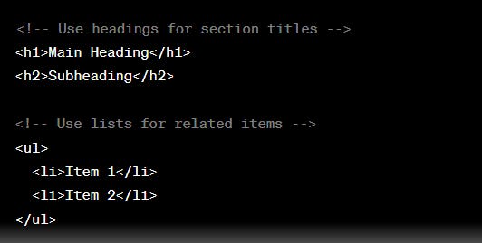
Semantic HTML: Use proper HTML elements to structure your content. This helps screen readers and other assistive technologies understand the content's meaning.

Text Alternatives for Images: Provide descriptive alt text for images to convey their meaning to users who can't see them.
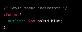
<img src="image.jpg" alt="A person using a computer keyboard">Keyboard Accessibility: Ensure that interactive elements are keyboard-navigable and have visible focus indicators.
Accessible Forms: Label form elements properly and provide helpful instructions:
<label for="username">Username:</label>
<input type="text" id="username" name="username" required>
These are just a few examples of how HTML and CSS can be used to create accessible web content.
GRID
a powerful layout system in CSS that allows you to create complex grid-based layouts with ease. We'll cover the basics of setting up a grid, defining rows and columns, placing items, and more.
1. **HTML Structure:**
Start with the basic HTML structure of your page. You'll need a container element to hold your grid items.
```html
<div class="grid-container">
<div class="grid-item">Item 1</div>
<div class="grid-item">Item 2</div>
<div class="grid-item">Item 3</div>
</div>
2. **CSS Grid Setup:**
In your CSS, target the grid container to set up the grid layout. Use the `display: grid;` property on the container.
.grid-container {
display: grid;
}
3. **Defining Rows and Columns:**
Define the number and size of rows and columns using the `grid-template-rows` and `grid-template-columns` properties.
.grid-container {
display: grid;
grid-template-rows: auto 100px auto; /* Define row heights */
grid-template-columns: 1fr 2fr 1fr; /* Define column widths */
}
4. **Placing Items:**
Place items within the grid using the `grid-row` and `grid-column` properties. You can also use the shorthand property `grid-area`.
.grid-item:nth-child(1) {
grid-row: 1 / 2;
grid-column: 2 / 3;
}
.grid-item:nth-child(2) {
grid-row: 2 / 3;
grid-column: 1 / 3;
}
.grid-item:nth-child(3) {
grid-row: 1 / 3;
grid-column: 3 / 4;
}
5. **Alignment and Gaps:**
Use properties like `justify-items`, `align-items`, `justify-content`, and `align-content` to control alignment of items within the grid, and `gap` to add spacing between rows and columns.
.grid-container {
display: grid;
grid-template-rows: auto 100px auto;
grid-template-columns: 1fr 2fr 1fr;
justify-items: center; /* Align items horizontally */
align-items: center; /* Align items vertically */
justify-content: center; /* Align content horizontally */
align-content: center; /* Align content vertically */
gap: 20px; /* Spacing between rows and columns */
}
6. **Responsive Grids:**
Use media queries to adjust the grid layout based on different screen sizes.
@media (max-width: 768px) {
.grid-container {
grid-template-columns: 1fr; /* Change to single column layout */
}
}
Some Ways to centre elements:
Sure, here are all possible ways to center elements in HTML and CSS, with code examples for each way:
1. Using the <center> tag
The <center> tag is an obsolete HTML tag that is used to center the contents of an element. It is not recommended to use this tag, as it is not supported by all browsers and can cause layout problems.
HTML
<center>
  This text will be centered.
</center>
2. Using the text-align: center CSS property
The text-align: center CSS property is used to center the text within an element. This property can be applied to any element that contains text, such as <p>, <div>, and <span>.
p {
  text-align: center;
}
3. Using the margin: auto CSS property
The margin: auto CSS property is used to set the margins of an element to 0 on the left and right sides. This effectively centers the element horizontally.
div {
  margin: auto;
}
4. Using the display: flex CSS property
The display: flex CSS property is used to make an element behave like a flex container. Flex containers can be used to center elements horizontally and/or vertically.
div {
  display: flex;
  justify-content: center;
}
5. Using the align-items: center CSS property
The align-items: center CSS property is used to center the contents of a flex container vertically.
div {
  display: flex;
  justify-content: center;
  align-items: center;
}
6. Using the position: absolute and top: 50%; CSS properties
The position: absolute CSS property is used to position an element relative to its parent element. The top: 50% CSS property is used to position the element 50% from the top of its parent element. This effectively centers the element vertically.
div {
  position: absolute;
  top: 50%;
}
7. Using the transform: translate(-50%, -50%) CSS property
The transform: translate(-50%, -50%) CSS property is used to translate (move) an element by a certain amount. In this case, the element is moved 50% to the left and 50% down, which effectively centers it.
CSS
div {
  transform: translate(-50%, -50%);
}
These are the most common ways to center elements in HTML and CSS. The best way to center an element will depend on the specific element and the desired outcome.
Different ways to add images to a web page:
Here are a few ways to add images to a web page without using the <img> tag:
CSS Background Image - You can set an image as a background image for an element using the CSS background-image property. For example:
div { background-image: url('image.jpg'); }Psuedo Element:
CSS Content Property - You can use the content property along with the url() function to display an image. For example:
div::after {
content: url('image.jpg');
}
Rapid ways to centre an element inside a parent container Vertically
To center an image vertically inside an element, you can use a few techniques:
1. Example : Set the image as a block element and use margin: 0 auto:
img {
display: block;
margin: 0 auto;
}
2. Example :Use flexbox:
header {
display: flex;
align-items: center; /* Aligns items vertically center */
justify-content: center; /* Centers items horizontally */
}
What is a Favicon ?
A favicon is a small icon associated with a website, typically displayed in the browser's address bar and tabs. Favicons help users identify the site and provide a visual cue.
You can add a favicon to your website using the `<link>` tag in the `<head>` of your HTML document.
The basic code is:
```html
<link rel="icon" href="favicon.ico" type="image/x-icon">
```
Where `favicon.ico` is the path to your favicon file.
Some points to note:
- Favicons should be 16x16 or 32x32 pixels in size for best results. Larger icons will be scaled down.
- You can use PNG, GIF or ICO favicon formats. ICO is recommended for support in older browsers.
- For wider browser support, you can include multiple favicon links:
```html
<link rel="icon" type="image/x-icon" href="favicon.ico">
<link rel="icon" type="image/png" href="favicon.png">
<link rel="apple-touch-icon" href="favicon.png">
```
The favicon will typically be displayed:
- In the browser's address bar
- On the tabs for that website
- In the bookmarks for that site
- You can create favicons using online tools like favicon.cc or using image editing software.
CSS Practice Notes :
1. Using a container div with a max-width
A common practice in web design for a few reasons:
Centring Content
One of the main reasons is to center content on the page. The `body` element fills the entire width of the browser, so applying `margin: 0 auto;` to center it does not work. By using a container div, we can apply a max-width and center it like this:
```html<div class="container"><!-- content --></div>``````css.container {max-width: 1140px;margin: 0 auto;}```
This centers the container div within the full width of the browser window.
Responsiveness
Max widths also make responsive design easier. We can define different max-widths at various screen sizes using media queries.
For example:
```css.container {max-width: 1140px;}@media (max-width: 1000px) {.container {max-width: 900px;}}@media (max-width: 800px) {.container {max-width: 700px;}}```
This allows us to limit the width of content at different screen sizes for an optimal experience.
2. Vertically center elements in CSS:
1. Using padding:
```css.center {padding: 70px 0;}```This adds equal padding to the top and bottom, centering the content vertically within the element.
2. Using line-height:
```css.center {line-height: 200px;height: 200px;}```By setting the line-height equal to the height of the element, the single line of text will be centered vertically.
3. Using absolute positioning and transform:
```css
.center {position: absolute;top: 50%;transform: translateY(-50%);}```This positions the element 50% from the top, then translates it up by half its height, centering it.
4. Using Flexbox:
```css.container {display: flex;align-items: center;}```The `align-items: center` property aligns all flex items vertically centered within the flex container.
5. Using CSS Grid:
```css.container {display: grid;place-items: center;}```The `place-items` property is a shorthand for align-items and justify-items, centering the grid item both vertically and horizontally.
The padding and line-height methods are simple but have limitations. The absolute positioning + transform and Flexbox/Grid methods offer more robust centering.
Using a % width
Percentage use allows the container to resize responsively as the viewport width changes. A fixed pixel width would remain the same size on different devices.
For example:
  button{
    width: 15%;
  }
The container will be 15% of the parent width on any device - mobile, tablet or desktop.
Tip:
Example to run validator after clone and navigate to it: use full path
python3 w3c_validator.py /path/AirBnB_clone/web_static/0-file.html
Resources :
Very clean, clear and understandable.